|
|---|
Friday, August 31, 2007

Wyatt & Doc are the official winners of Sergeant's Splish Splash Photo Contest. We have their 1st proofs on-line today. Of course all of our work is custom so Deborah and her Bulldogs can request color changes as needed.
These adorable Bulldogs belong to photographer Deborah Sprague.
This national competition recognizes students’ artistic expression with awards in the following categories: Mixed Digital Media, Web Page Design, Graphic Media, 3-D Animation, Film, Interactive Media, Photo Illustration and Free-Hand Art in Digital Form. Film is a new category this year.
Students may submit up to two entries. Entry forms, contest rules and other details are available online. The submission deadline is Oct. 8, 2007. More
Thursday, August 30, 2007

What inspires you? If you are an artist, who or what influences your artwork? How often do you feed the well? What type of objects do you collect or find joy in? As we go into the weekend think about those questions and go out and grab hold of some inspiration.
Like most artists I find my inspiration in a wide variety of areas. Here is a partial list of things in the world that light me up and inspire me to create: dusty old ephemera, broken or rusty machines, shiny new gadgets, packaging ...any kind of packaging, books, rain, school supplies, music, children's toys, signs, old album covers, photography, dogs, cats, handbags, friends, birds, new cities, paper, brand new art supplies, youth, the color green, old books, Elvis impersonators, magazines, power tools, garage sales.
Wednesday, August 29, 2007

This is Oscar. His humans took a great shot of him in his favorite spot. Capturing your pet in a favorite location will ensure that your pet portrait will make you smile for years to come. Even though we have colorized the couch and pillows, this boy's posture says it all and when that sofa is no longer around everyone will remember Oscar lounging on the back of it.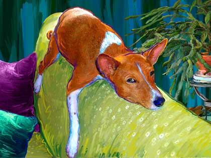

João Biscainho, AZAP!(As Zoon as Possible)
From the 2 Stages exhibition at the Centro de Artes de Espectáculo de Portalegre.
Tuesday, August 28, 2007
One could say that our first performances were exactly as embarrassing to watch as only performance art can be. You know, when it comes to a point where the toes of the audience really start to hurt and everyone but the performers get soaking wet from sweating.- Michael Elmgreen and Ingar Dragset
Conclusion: no matter how bad the art, there is always hope. So before destroying and discouraging, relax. Think of the beautiful belly on this door, and of the time it took to grow. Respect that.
Pictures are of works by Elmgreen and Dragset: Belly Door (2006) and Powerless Structures, fig. 187 (2002)
Here is an interesting interview related to another work they made.
Labels: performing, sculpture
Don't have time to market yourself? Read this great little article by Ilise Benun called "Mark Your Calendar". It is geared towards graphic designers however the advice can be modified for your own personal needs.
There is even a pdf calendar for 08 that you can download for free. This was found through my How newsletter. "How" is an incredible design magazine that I have been following for years. You can order it through Amazon or just follow the magazine on-line.
I will be posting more dog artwork later this week. I have been in a real blogging slump for a few days, posting mostly references to other sites and artists. Below is a wacom sketch of a frog I did last year. I decided to post this today in honor of all the poor froggies that our Scottie-Girl Pixel has been terrorizing in my backyard this summer.
Monday, August 27, 2007
Over the weekend I heard a reading on NPR of some of Merrill Markoe's writing. She is very funny. I went in search for an audio clip at NPR and then dug deeper to find her own site with several fun video clips. She has a great way of talking and thinking like a dog.
Sunday, August 26, 2007
Saturday, August 25, 2007
Labels: Downloads, Illustrator
Flickr has a wide variety of groups devoted to collage work.
Here are Just a few I have stumbled across:
Collage Vintage Art
Vintage Collage Art
Collage Crazy


Just one remark (I can't seem to resist the theoretician's temptations of spoiling any pure, unintellectual fun). Notice the postal stamp on one of the postcards. The pleasure of seeing the "unmediated" pictures (although obviously the print suggests they are vintage publicity postcards for Paris venues) is blocked. There is, at first, a feeling of betrayal of the medium. Ah, this is not an image, it is just a postcard. It was used, handled. We are not in the presence of the original, of the source, but of some specific copy. "Specific" is in italics, because paradoxically the specificity is what, at first, appears to take away the uniqueness (aura) of the work.
But then arrives the second movement: the picture has a story. It was someone's. Someone mailed it to someone. There is even a hidden part to it! Also, the painted-on colors seem to gain depth, as they become the ideal mask, the part that doesn't lie, as it does not age, it is not a face, not a breast, it is merely the décor, the play, the mask, it is the surface that remains, it is the stamp, it is the frequency of color, nothing more, and strangely, this surface is what takes these bodies on a long and always illogical journey here.
Labels: etc, painting/photo, theory
 Fritz Haeg has been recently creating edible landscape design. Or eatable landscaping. Or vegetable social gardening. Or call it what you wish. In any case, it's only with edible plants. And apparently that's just about the most in thing around these days. But that's not what I like most about it. The best part of it is its connection to the idea of creating a public space out of a private one. Haeg's transformation of space involves a community working on a private front lawn to transform it into a public space, a sort of a public vegetable garden.
My favorite fragment from a very interesting interview:
I am very interested in the real economics involved once you deviate from the commercial conventions of the art and design world.Scary. Scary.
Most of the work I have been doing never paid until recently. For years I supported myself mostly by teaching and some modest architecture fees for small projects. Now I teach occasionally and I support myself from (in descending order) architecture design fees from the few projects I do, artist commission fees from museums, occasional teaching salaries, speaking honorariums, writing, and a bit from the Sundown Schoolhouse. The amount I actually earn from any one of them varies wildly, so I do what I do and hope every thing balances out in the end. I’m always living right on the edge though. That uncertainty is the price of doing work that does not have a conventional market.
It is also interesting to compare this to the type of question that has been recently raised in Portugal - about the illegal hortas, or vegetable gardens often in the perimeters of cities and often in public spaces, which are often seen as a horrible left-over of the Salazarist era. Today some people seem to have a different approach, considering this an important cultural and aesthetic heritage.
There is something anarchist about promoting the Estates and the hortas, that both attracts and repels me. Maybe it's the feeling that this "new aesthetics" is being forced on us the same way any attempted revolution imposes a new set of values as "universal" (notice, for instance, how in the interview the more reticent onlookers are seen as retrograde and "regressive").
Labels: art world, land art/urban
Friday, August 24, 2007
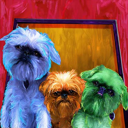 "Fraggle, Puma, Pisces"
 I never thought opening doors could be an erotic experience. And yet, the very form of a hand brings us to a very sensible-sensual situation. It's probably an alter ego thing. A Pygmalion thing. And, as all naturalist sculptures are, a somewhat creepy thing as well. This charming Hand-le was made by Naomi Thellier de Poncheveille.
(via)
Labels: design/architecture
Thursday, August 23, 2007
Wednesday, August 22, 2007
Oh, and on a side note, our Luna had her Spay yesterday ... no more unwanted pups! I guess we will be in search for a forever home for Luna next week. I am really getting attached, and yet 4 dogs seems like a bit much for us.

Tuesday, August 21, 2007
I thought I had it under control. The internet, after all, is not that difficult to move around. Not if you know what you're looking for. One does expect the unexpected, but to some extent. And then comes a site which just blows the lid off your expectations. I've had it happen to me several times, and this is one of them. i heart photograph probably only appeared on my radar now because I thought, well, it was about photography. Which it is. And its brilliant. And its curatorial eye is just damn good. It plays with the concept of photography as an art form, extending to basically any photographic work, whether it is manipulated or a documentation of an installation or anything that at a given point went through a lens. So while I'm working hard to make a show, you go ahead, and betray me. As you can see, it's worth it.


Stefania Galegati, Untitled (Dwarf 2)
Sannah Kvist, Untitled
Vibeke Tandberg, Mother+Dog, Variations #1
Koen Hauser, from Modische Atlas der Anatomie
Joel Tauber, My Lonely Tree
Adrian Nießler and Catrin Altenbrandt, from Um Was Es Nicht Geht
Melanie Bonajo, Bears
Kjersti Berg, Opp/Up
Yvonne Todd, Anonymous Cat
All images via i heart photograph.
Here at Art Paw we use Photoshop filters in all of our works, even the most heavily painted piece is going to have some filter somewhere beneath the smudgy wacom paint layers. We do like to say that we do not rely on filters alone to achieve our results, and so we too may be guilty of down-playing the importance of filters. A digital artist that is good with filters and has learned the art of combining several filters, and adjusting their opacity to achieve spectacular results should not be ashamed of their knowledge, or feel that it is somehow inferior to traditional painting. I am blessed to have a number of traditional artist friends and associates that seem to respect my work, and digital art in general. I do realize though that there will always be "purists" that feel that Photoshop and digital art is in some way cheating. I would have to pause and ask a painter that considers themselves a purist if they are indeed mixing and grinding their pigments to create their own paints? I am sure that when commercial paints in little shiny metal tubes came onto the market place there were probably some old hold-outs that swore up and down that "true artists" will always mix their own pigments the old fashion way. I see the computer in much the same way as commercial "tubed" paint. It is a tool, just one more tool for an artist to explore.
Labels: Process and Tips
Monday, August 20, 2007
Sunday, August 19, 2007
 K’ung-fu-tzu (Confucius) by mi-mi (Mila Kalnitskaya and Micha Maslennikov)
Notice this is real.
Notice the starting point is water.
Notice the frog has no choice but to fly.
Notice she doesn't seem to care.
Notice we hardly have a way of knowing.
(via)
PS: From an interview about the performers in the various pictures:
Confucius is unequivocally a Shakespearian character. He is superb in tragic roles. If the project could continue, he would make a remarkable King Lear.
Labels: funny, painting/photo, sculpture
Saturday, August 18, 2007
There are billions of different Web pages floating around the Internet, and unless you have the ability to trawl Google and memorise the URL of every page of every site, there's no way you'd survive out there without a little help.
Thankfully, we don't have to wander round the Web feeling our way like a zombie in a maze. Navigation forms the basis of any Web site, and always has done. Despite the fact that it is a necessity of Web design, it has become something of an afterthought for many designers, as they concentrate on trying to get clever with content.
Navigation remains the single most essential aspect of site construction, and the wonders of modern technology mean you can guide your visitors around your site in a range of innovative ways to make their online experiences all the richer and more rewarding.
What’s the point of navigation?
For the benefit of anyone arriving on the planet in the last few minutes, the base principle of site navigation is to help your visitors find their way around your Web site, providing links to all its pages. Common sense reasons that it is imperative that your site is easy to navigate or your guests will soon leave the party for pastures new.
The home page of a web site is where visitors form their impressions about the entire design, and its importance far outweighs that of the other pages that make up the site. The same theory applies to the site's navigation mechanism, ie if you manage to convince new visitors to make the step from your home page to one of your sub pages, the chances of them wanting to peruse the other delights on your site increase no end.
Proper site navigation should give the visitor a sense of 'place' within the site. it should help you maintain consistency throughout the site, even establishing something of a brand. It's important that anyone delving through your site knows how to get back to where they started, otherwise they're likely to flee in frustration.
Your navigation system should also encourage the user to explore other areas of the site by suggesting pages of related interest, and challenge their minds by pointing them towards more obscure links elsewhere online that will interest them. Ultimately, your top priority when designing site navigation is to ensure that the user doesn't have to work hard to find everything you're offering.
Traditional navigation
Back in the old days, navigating the Web was a completely different experience from the one you'll see today. We all know that developments in Web design software have made it easy to create prettier pages with flashy graphics and stylish content, but site navigation has also evolved considerably.
In the late Nineties, when the Web was just beginning to take shape, the core device for site navigation was the trusty textual link, and a blue underlined piece of text was your ticket to a world of information. once clicked, the text link would turn purple (or sometimes red) to indicate that this was one corner of the Web that you'd already explored, and this became something that even newcomers to the Net could get their head around right from the off. Of course, these conventions still apply today, albeit in a slightly more 'glam' format.
A few years ago, the closest you'd have got to a graphical interface on a site would be a series of boxed text links across the top of the page of running down the side. Occasionally these would be accompanied by hideous animated G11's or clipart that vaguely represented the part of the site a link pointed to ('borne' would be a house, contact us' a phone, 'buy' would be a stack of coins, etc).
Just because these navigation systems seem a little primitive from this side of the Millennium, it doesn't mean
they weren't effective, and they are still used in some form these days. The Site Map, for instance, was one of the first devices to appear, and still represents probably the quickest way to find your way around large Web sites. On the whole though, exploring a collection of pages in 2003 is a much richer experience than it was seven years ago. The emergence of modern WYSIWYG design applications and advancements in graphic manipulation technology have meant that Web developers can get more imaginative with their navigation bars in order to truly achieve usability.
Navigation musts
If you mosey along to any Web site worth its salt and look carefully at how it was put together, you'll notice that all the big sites follow the same navigation methods a tidy nav bar for effect with a bandwidth friendly set of textual links somewhere on the page. However creative you think you are, or however much you want to hurl saliva in the face of convention, there’s no use trying to fight against these methods. They work and they always will work, and users are unlikely to stick around if they don't get what they're expecting.
Textual links, or embedded links, are the most basic form of navigation and represent a clear, instant method of accessing pages within a site. These are generally arranged in the form of a series of underlined words across the top of a page or a list running down the side.
Another key device in the quest for an easy ride online is 'breadcrumb' navigation. By using trails of HTML links, you can show the route from the home page to the current page, helping the visitor to move up and down the menu tree more effectively, especially on large, page heavy sites.
In order to give the user the richest, most diverse surfing experience, it's wise to slap in as many related links, within reason, as you can unearth. The key here is to avoid simply using the obvious links, and to add pointers to more obscure, off the wall sites that are likely to titillate your readers, adding greater value to your site in the process.
It's also important that you position your navigation links in a place where the user will expect them to be, and where they won't intrude into the content of your site. Many Web designers favour the placement of links along the top of a Web page, plus down the left or right hand side, and at the bottom of each page for good measure. Basically, you need to make sure that your visitors are never more than a scroll wheel rotation away from the next page. Make sure you stick to colour conventions too blue is generally recognised as the norm for a text link, with purple or red used to indicate a page that's already been accessed by the browser.
New methods
While these traditional navigation principles should still be foremost in your mind when designing pages, there are a number of trendy new devices kicking around town that are also worth thinking about.
Let’s first consider image maps, a navigational tool that has the potential to be something quite special, but which invariably turns into a confusing mess. The key to achieving a workable image map is to choose your picture carefully. Make sure it's something that lends itself to being logically sliced up and split into parts, rather than a generic piece of art with no determinable boundaries within it. if you can afford to do so, buy the image in from a picture agency before slicing it up in Image Ready (or a cheaper alternative such as Paint Shop Pro) and exporting it to your Web editor to apply the rollovers.
If pictures aren't your bag, or if you're keen to avoid bandwidth heavy navigation, you may want to think about exploring the DHTML route or even applying JavaScript pop up menus. While these have been around a few years now, they're still called upon by pro designers as a means of adding dynamic navigation. Adding DHTML menus is far easier today than it ever was, and there's plenty of software around that will do the job for you without you having to lift a brain cell.
However, when it comes down to designing sites 'in the Twenty first Century, you won't find many better tools for the job than Flash. Macromedia's cherished vector graphics application houses all the functionality you need to produce slick, easy to follow, fast loading navigation. The program allows you to create virtually any type of dynamic navigation system you can think of, from stylish icons and Flash buttons to pop up and pull down menus. Flash is also great for generating actions and animation within a navigation bar in order to engage the user and promote interactivity.
Ironically, relying too heavily on these swanky new navigation methods can lead to your site becoming overwhelming to a visitor, and a jamboree of weird and wonderful menus is no use to anyone. If you are intending to use devices such as Flash or JavaScript menus, always make sure this isn't your sole form of navigation, and that there are text links for those without the right plug in. As accessibility is what we should all be striving for these days, you should always be sure to include ALT tags on any images you include in your navigation to cater for anyone using a screen reader and make sure you create a text only version as well.
If you really want to know if your site is truly useable, the best idea is to unleash it on a group of friends and get them to try and navigate it. Come up with a list of things that a user might want to do on the site, then observe your guinea pigs as they try and access the information. You'll soon learn that it pays to keep things simple and not to try anything too elaborate when designing navigation. That's not to say you can't be original, and with advancements in creative applications such as Flash, navigating Web pages can only get more enjoyable.
Labels: Articles

Friday, August 17, 2007
Thursday, August 16, 2007
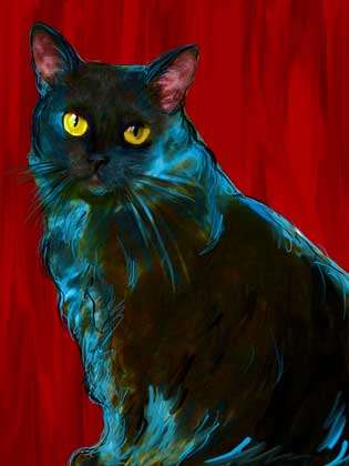
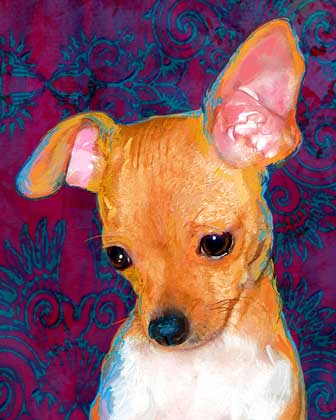
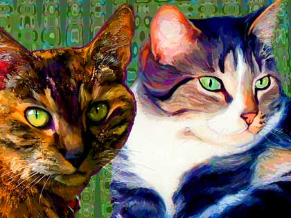
This month we have a lot of Kitties and also a few Chihuahuas to work on. Tonight I have a few pet portraits to print and a few more to start on. This week has flown by!
Now is really the time to order for Christmas. I have recently changed our turn-around time to 4- 6 weeks on the painterly style. This is due to the number of both portraits and design projects we have in-house. All clients with an existing order on the board right now will still be slated for the original 2-3 week time frame.

I am now going back to rehearsals of Hamlet Light, which will have its premiere on September 15th at the Teatro Municipal de Faro and will be in Lisbon on September 28-30.
In order to enjoy theatre, shouldn’t we forget it? Forget that we’re inside a theatre, forget how it works? How about if we just forgot the whole idea of a production and simply focused on how to advertise it? If instead of the play the audience saw the creation of a play’s trailer? What would remain? What would the new scale of possibilities be?
More on this later.
(My activity here might slow down a bit. Or not.)
 Lucy Pullen Ropeswing (2003)
(via)
Labels: painting/photo
The exhibition is open to all photographers and digital artists. The artwork must be original, entirely of the work of the entrant and completed within the last three years. Entries must not be copies or derivatives of copyrighted or published paintings or photographs. Artwork that has won an award in previous ADSO exhibitions may not be entered.
Registration will take place at the Arts and Design Society’s Art Center Gallery, on Monday, Aug. 20 from 8:30 a.m. to 1 p.m.
Entry fee for the first three works:
High School Students – $15
ADSO Members – $25
Non-Members – $35
Additional works can be submitted for $5 each. Each entrant can only submit up to six works. Registration forms may be picked up at the gallery from 1 to 4 p.m. on Friday and Monday.
The opening reception will be held on Friday, Aug. 24 from 6 to 8 p.m. Awards will be given out during this reception.
Arts and Design Society’s Art Center Gallery is located at 17 1st St SE in Fort Walton Beach. For more information, call (850) 244-1271 or visit the ADSO website at http://www.artsdesignsociety.com
Labels: Art-Locations, Contest
Wednesday, August 15, 2007
Bagiński's work is just incredibly Polish. He seems very fond of moral stories, on the verge of moralizing, there is usually the question of the individual and the individual choice vs. disappearing, becoming nothing. Also, besides the social critique, the visual side of The Cathedral (which was nominated to an Oscar for best animated short film in 2003) is reminiscent of (or plain inspired by) the great Polish painter Zdzisław Beksiński:


Labels: film


