|
|---|
Sunday, October 30, 2005
Labels: painting/photo
Friday, October 28, 2005
Below is the first part of a review of the Lisbon design biennale ExperimentaDesign 2005 that I wrote for the Polish review Architektura (to be published soon, in a shorter and slightly modified version). Translated here for your global enjoyment.
ExperimentaDesign 2005: The Medium is the Goal
 The Lisbon ExperimentaDesign 2005 is a biennale of paradoxes: brilliant works stand next to silly provocations, ingenious discoveries next to funny, though useless ideas.
This is hardly a surprise. Contemporary design remains in a state of tension between its high culture-forging aspirations and the commercial prose of life. Money can’t buy everything (e.g. many projects are related to activism); but even what it can’t buy has to be sold. Even if it is to convince others.
That’s where modern design gets all its power. It quietly enters more and more parts of our lives: from publicity to politics, from architecture to film, from media to street art. It does it quietly, although the limit of culture and commerce seems like an ideal situation to remain in the center of attention. Still, designers rarely appear on magazine covers or TV shows.
The Lisbon biennale moves design out of the shadow of anonymity. In a well-prepared, incredibly diversified series of exhibitions it shows the trends, the fashions, but also the characteristic styles and unique approaches. It’s not afraid of controversy; on the contrary, it proves that yesterday’s scandals are today’s common bread. You can feel it’s an ongoing experiment - although it doesn’t always mean innovation.  Sometimes, it’s as simple as juxtaposing a commercial with a political flyer, or using classical design in an artistic installation.
The 6-year-old biennale has a strategic partner for its main events: the Belém Center of Culture. This large complex far from Lisbon’s center, created from the first funds of the then European Community, is a symbol, that the Portuguese, usually full of complexes, can do it after all. The modern, if modest-looking, building contains concert and theater halls, exhibition spaces, and among them an excellent Museum of Design. But this time the Museum is empty. The visitors line up to the biennale’s largest exhibition, Catalysts!
Catalysts! is an exhibition with a thesis. According to the curator Max Bruinsma, we can’t consider designers neutral helpers any more, professionals limited to solve the clients problems. They are rather “critical cultural agents”, or - “cultural catalysts”. That’s why in an exhibition which might at first seem as a classical graphic design showing, we get something far beyond - communication design, ranging from typeface to publicity to video to logos to fine art to pretty much anything that communicates.

The exhibition is divided into four main, autonomous parts: Believe, Seduce, Inform and Engage. But actually it’s all just one big seduction. And as it is usually case with flirts, it’s not the message, but the very process of transmitting that plays the main part. Soviet propaganda (considered as the beginning of modern design!), pro- and antiwar posters coexist with commercials of soap or underwear. Next to the chronology of design, we find a quote from Henry Ford: “We want artists in industrial relationship. (...) We want those who can mould the political, social, industrial, and moral mass into a sound and shapely whole”. The unsettling motto has no comment next to it concerning the (controversial) morality of Ford himself. Designers are also not interested in the analyses of the content of the Bolshevik postulates or discriminating commercials.
 Designers-catalysts are interested in attracting attention. On a poster created in 1999 as publicity for his own lecture, one of the most renowned contemporary designers Stefan Sagmeister (who recently won a National Design Award), we see the naked author. All the information was cut out on Sagmeister’s skin by his assistant. This cynical use of one’s own body is one of many examples of adapting artistic ideas from the 60’s and 70’s to commercial purposes.
Using historical motives isn’t limited to one era: any past is good for transformation. Thus, we can find a pastiche of the great publicity classic made by Tide in the 50’s, made by James Langdon. The name of the product is replaced by the word “ediT” (the name of the work is “Turn the Tide”), inviting to a creative game with the past. Catalysts! shows the best of the players. Instead of creating a new, expensive brand image, they use ready solutions everyone knows, acting through a subversion of meaning, encouraging us, the consumers, to think - and to choose the graphic Robin Hood. One that’s incredibly similar to his colleagues, the artists... with one exception: contrary to the artists from the 70’s, today’s designers don’t seem to be overtly worried with why something is important. And that is, no matter what they might wish us to believe. Langdon does not explain why he chose precisely washing powder. Sagmeister’s self-inflicted wounds are important only because they are visible. It is supposed to be the viewer’s task to develop a critical distance. Yes, but how?
Pictures: 1&2: The Most Expensive Dress, Silke Wawro; 3: Seduce, Max Bruinsma (?); 4: Poster, Stefan Sagmeister. All photos by Verónica Fernandes.
Labels: design/architecture, exhibitions, Portugal
Thursday, October 27, 2005
Here is a play between art (and recently a similar one visited Lisbon), politics and faith. How about that?

From here. The design could be better, but this is just a steam-off.
Labels: design/architecture
Monday, October 24, 2005
The philosophical ideas were not really there from the beginning, but they have grown more complete with the years. It's not important just to make things, but also to reflect about them.
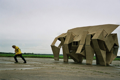
After so many years, are you in control of the beach animals or are they really controlling you?- Theo Jansen, in an interview with Sebastian Campion
They have always controlled me. I obeyed their laws. Only recently they do what I want.
[People] want to help me, they want to go with me and join me in my dream. That stimulates me very much. I think that somehow the beach animals are really personal. Some people, who never saw them before, recognize me in the animals when they see them. It's strange but it also feels good. I mean, then I know that I am the inventor and that nobody else could have done it.
And here is a video (click on image):

Labels: sculpture
Sunday, October 23, 2005

Adbusters has an interesting insight into the art world's recent flirts with corporate business. The article doesn't really investigate the issues - at times appearing somewhat superficial. On the other hand, it clearly shows an ethical issue increasingy present not only in business of art, but in other fields as well. The big issue is: when and how are we allowed to judge a combination of business and art? The classic example is of a big company not always with clean hands that creates a foundation or fund of some sort that, say, supports culture. Clearly, they are trying to change their image. But in many cases they are making a huge difference (take the Saatchi collection, or Bill Gates' foundation...) . I don't think the right attitude is to simply refuse this sort of combinations - it seems unrealistic. The question I have is: are there any ways we can improve the situation? Besides trying to bring to justice the companies that act unethically, is there anything we can do? I would say, paraphrazing the wonderful Polish poet Herbert, that it might just come down to a question of taste. If one has a well enough developed taste, or sensibility, the motorcycle exhibition at the Guggenheim should be ridiculed. Not because motorcycles cannot be considered art - I know of an artist who spent a year making pancakes as art (and created a number of delicious works). There is simply something too PR-like in it. I mean, we cannot still be believing that the good people at the big companies only want to help out. And if we don't believe it, we must see how they help and what else they do when they're out of their angel wings. The thing is, I don't have time for checking all this all the time. Which is why I rely on others, journalists, critics, curators. And here, another question appears: the paranoia of the big bad corporate wolf that simply cannot do the right thing. I had that impression when seeing A Decent Factory at the DocLisboa film festival. It's an ever-more common (and irritating) case of not giving the big players a chance to try and improve their conduct. The way the film's director, Thomas Balmès, sees it, Nokia, the film's main (anti-) hero, simply cannot make a right move. They are bad because they work with suppliers from China, they are bad because they try to improve the work conditions there, because they certainly can't handle it, because, well, they're silly. It's a falsely "objective" way of seeing corporate activity, which starts off from a position that is simply unrealistic: that corporations can be something else than corporations. Which brings me back to the Adbusters article, which, although is interesting, irritates in a similar way. The author simply doesn't leave any space for actual improvement:
With arts funding drying up during the Bush administration’s renewed culture wars, it’s no newsflash that museums like the Walker are turning to private support. The real surprise is that it’d open its hand to electronic store chain Best Buy, an entity run by executives who, according to BuyBlue.org, made political contributions totaling more than $45,000 exclusively to Republicans in the 2003-2004 election cycle. Is the quick fix of corporate cash worth the long-term effects of alliances with those who support arts-averse politicos?If we think of art sponsorship in these categories, we shouldn't accept anything that comes from corporations or big companies, since we can be sure at least some of the bosses are friends with people we don't like. In this case, it's blatant: a company that supported a political bad guy decides to supports arts (which he doesn't). Instead of being happy that they aren't as close-minded as he is, the author gets upset! The question is: if, knowing we can't always count on the government or the public, we refuse those "business" opportunities as a rule, how are we, the artists, supposed to make a living? Off Creative Commons?

Labels: art world, commercial, political
Saturday, October 22, 2005

I have just learned that the art couple Diller and Scofidio (their studio is actually now called Diller Scofidio & Renfro because of their new partner Charles Renfro) have won the prestigious National Design Award 2005 for architecture design. I've written about their Blur Building here.
(N.B.: Notice their web page isn't working. It hasn't been working since at least July. Which goes to show how overrated the importance of PR actually is! - Or is "under construction" an allusion to the architects' never-ending dreams?)
Labels: design/architecture
Friday, October 21, 2005
 Thank you, Paul Stremple, for making the world a happier place and giving us the Banana Bunker. This wonderful object... well, I'll let you imagine what it does. For now, it is an exhibit at the New York MOMA exhibition SAFE: Design Takes On Risk.
If you still think a successful invention is all about the idea, see the Banana Guard, an earlier, unrelated invention that hasn't quite won the world over as the Banana Bunker seems to be doing. The BB is a true designing gem. The, hum, sex-appeal of the fruit is here played with in such a subtle, pleasant way, it can only make you smile. I don't know if it works yet (will order one as soon as I get out of debt), at least as banana protection. As a fine, art object it's working for me already.
Labels: design/architecture, funny
Wednesday, October 19, 2005
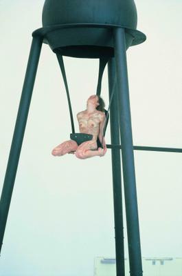 Today's viewing of the film Comer o Coração de Rui Chafes e Vera Mantero by Inês Oliveira (during the DocLisboa documentary film festival) made me go back to the original piece of art by the unusual duo - dancer Vera Mantero and sculptor Rui Chafes.
I must admit the work - called Eating Your Heart Out - struck me instantly as somewhat pretentious, pompous even in its post-expressionist "wild and true" attitude. Here is why: what you get is really a combination of two hermetic worlds. One is the hard-core line of modern (neo-modernist, I would dare say) sculpture. The other is the no less esoteric work of contemporary dance, one that still hangs on the "interior truth" ideals (the truth is within you, be true to yourself, etc.), but takes it to another level, accepting anything that's visceral, be it African shamanism, Bali ritual or Indian grotesque face-making. (You could call it post-modernism at its most obvious, if you wish. I'd rather not, since calling something post-modernism just because it includes elements from different epochs and places seems naive, considering similar procedures in the rest of art history.)
Combine the two and you get... well, what exactly do you get? A combination of the two. Does it mix? And does oil mix with water? Of course it does - creating a specific design, a dance unique for this combination.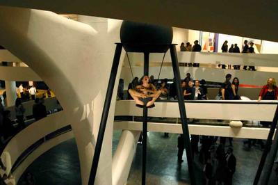
The problem I found with it was that it was extremely hermetic. Someone I know who worked on the production of the piece told me it was quite different at the Sao Paolo Biennale, where visitors could see it from all levels. Thus, you could be right next to Mantero during her performance, or above or below her. The variation of point of view allowed a true visiting of the work.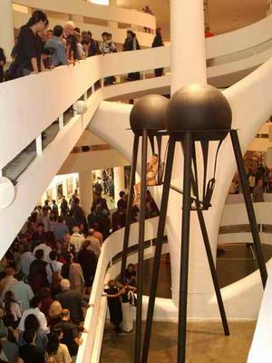
In Lisbon, at the CCB, all we got was a view from the bottom.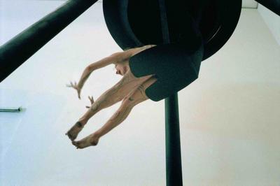
Obviously, a large sculpture always has this sort of limitations. Here, though, we found ourselves deep in the pit, far from the heart, whether it was "eaten" or "vomited". (1) You face a huge metal sculpture, with a tiny little person up there, moving, screaming, singing, whistling - but all this seemed, well, almost symbolic, not direct, not present enough. Problems with distance scare me, as they seem at once subjective and difficult to surmount. A couple of glasses of wine, maybe?
Something else struck me in the documentary, though. The film is a fairly simple following of the piece's evolution. And what we see, is how the process of mythologizing art comes to being. How
matter turns into narrative, turns into object, movement, symbol, how content is transfered into the "as if" zone, or the "suspended disbelief" zone. Only through discovering the process did the work gain weight for me. Which is a common paradox of much of modern art: the artist abandons you. She has a key, but she decides you are to find your own key. And it is probably because of my laziness, but I simply usually don't feel like making the effort. It seems less... fun (?) to make up my own possible stories than to discover that the idea came from a balloon, from the idea of suspension, and from the idea of an eye, and of a being, a strange being. I can still make my own story, but learning about the roots gives me more momentum when I embark on the voyage.
In the work itself, the balloon has long disappeared. I am left with a ball, a dot. Closed into itself, the art-ist lives herself out, and her art - the wonderful discovery of the inner self.
But that implies that I am already a believer (in our cynical times!). That I believe in the self as strictly inner. And, for that matter, as a true self. And, of course, that I believe in wonders.
Which, to me, is a fair definition of hermetic art.
What is shared in the artistic expreience? Notice - it seems to be the artist's experience, but it is usually described as if it were the viewer's experience. No wonder sharing is so difficult. This is confusing empathy with confusion.
It is a strong piece of work. Both artists know their crafts, they know their references. They know how to build a structure of references. Nonetheless, references aren't always enough to integrate. Not enough to create a world. Especially, when the artists think of themselves as discoverers of new territories. As combiners, joiners. Balance and rooting seem key here. They are both very delicate issues: one has to do with the specific dynamics of each area of arts, they other, with the way one uses what came before. The balance seemed wrong here - the language of fine arts, with its silent phrases and comfortably clean lines, ate the heart out of the performance. Vera Mantero became a small, funnily painted strange creature, suspended too high. At least too high for me.
(1)Vera Mantero mentions (link to Portuguese site) she doesn't really identify with the title, as she is rather "vomiting than eating" the heart. She considers her performance to be an "answer to the title". Another strange thing about the title is that in English, it is Eating Your Heart Out. The Portuguese title would literally mean "to eat the heart". It comes from a sentence by Musil that Rui Chafes mentions in an interview (link to Portuguese site): "it is necessary to eat one's mother's heart [out? - vv.] to understand the language of birds".
Labels: film, performing, Portugal, sculpture
Tuesday, October 18, 2005
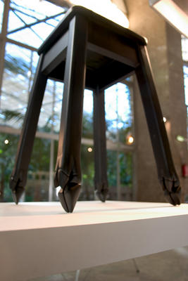 This wonderful stool, called Pata Negra (Black Leg, though it sounds way better in Portuguese), is a creation of Fernando Brízio, a young, but already quite prodigious Portuguese designer. It was presented at the ExperimentaDesign 2005 biennale here in Lisbon. More on the biennale soon.
(in the meantime, check out some nice designs, mainly Portuguese)
Labels: design/architecture, Portugal
Saturday, October 15, 2005
 It's pretty clear this is not Bacon. And it's pretty clear it's close, but later, oh, so much later, more angry, desperate, less attentive to the gentle tones melancholy brings to cool you, to ease the mad desire for pain.
And please don't mention the Fontanas or Pollocks, please don't make it all dry as a conceptual artist's funeral curator. If it reaches deep enough, why transfigure every last drop of paint? Damn it, be angry, and moreover, be angry well. Make it work. Turn the anger into something.
Construct. The clean, fresh lines contain the space of lovely, furry things. The charming mirrors and subtle lights bring us to the genteel fheeling of artsyness. "Pardon the mess." "The mess? What mess?" "[making an unclear gesture with the hand, maybe as if to show a landscape] Well, you know..." "Would you look at that beautiful plant! And the humor, the dynamic humor! Tell me, where do you get these ideas of yours?" "[still somewhat confused] Ideas? Ah, yes.
You know, it's all in what you choose to see."
All works are by David Altmejd (in order of appearance: Sarah Altmejd (2003), The Builders (2005), Untitled (2005)).
Labels: sculpture
Monday, October 3, 2005

Katarzyna Kardasz, Lena/sister
Labels: painting/photo, Poland


